DealDash AI
DealDash AI is a user-centered concept for a mobile application that helps people discover, compare, and act on food deals more efficiently. The project follows a chronological design process, moving from problem discovery to research, ideation, prototyping, iteration, and future planning.
Introduction
DealDash AI began as a response to a simple but frustrating problem: food deals are scattered across restaurant apps, delivery platforms, and loyalty systems, which makes comparison slow and mentally exhausting.
The idea behind this project was to create a single experience that reduces friction and helps users find the best value without manually checking multiple services.
Problem Identification
The first phase of the project focused on defining the problem clearly. Users face multiple separate platforms, each with its own rules, discounts, and reward systems. That creates decision fatigue and makes it hard to know whether a deal is actually worth taking.
The central problem statement became: Users lack a centralized, efficient way to identify the best available food deal in real time.
This problem matters because deal discovery is time-sensitive. When users hesitate, the offer may disappear, the price may change, or the best option may no longer be available.
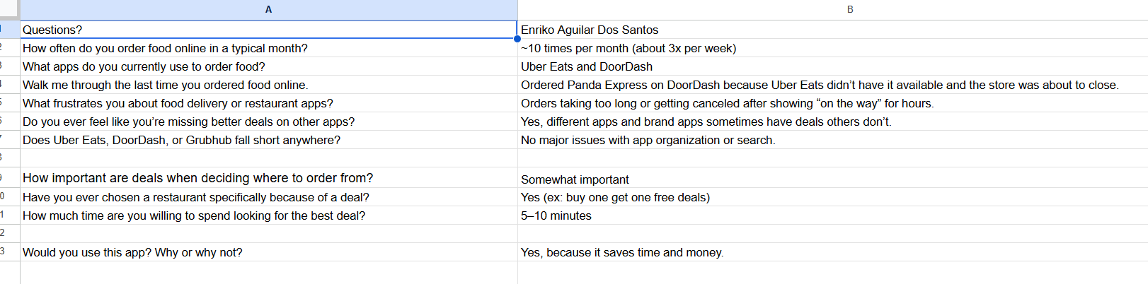
User Research and Interviews
To validate the problem, informal interviews were conducted with people who regularly use food delivery and restaurant apps. The goal was to understand how they compare offers, what slows them down, and what they expect to see first on a deal-focused interface.
- Users wanted to save both time and money when ordering food.
- Many participants switched between multiple applications before making a decision.
- Users were frustrated by inconsistent deal visibility and unclear comparisons.
- Participants preferred ranked results instead of having to hunt through several platforms.
These findings confirmed that the problem was meaningful, especially for college students and budget-conscious users. The research stage also showed that the interface would need to prioritize clarity over feature overload.

Design Goals
After research, several design goals guided the rest of the work.
- Minimize the time required to identify the best deal.
- Reduce cognitive load by presenting structured information.
- Improve transparency around pricing, discounts, and savings.
- Integrate with existing platforms rather than trying to replace them.
These goals shaped the layout, information hierarchy, and interaction model throughout the project. They also kept the concept focused on utility instead of novelty.
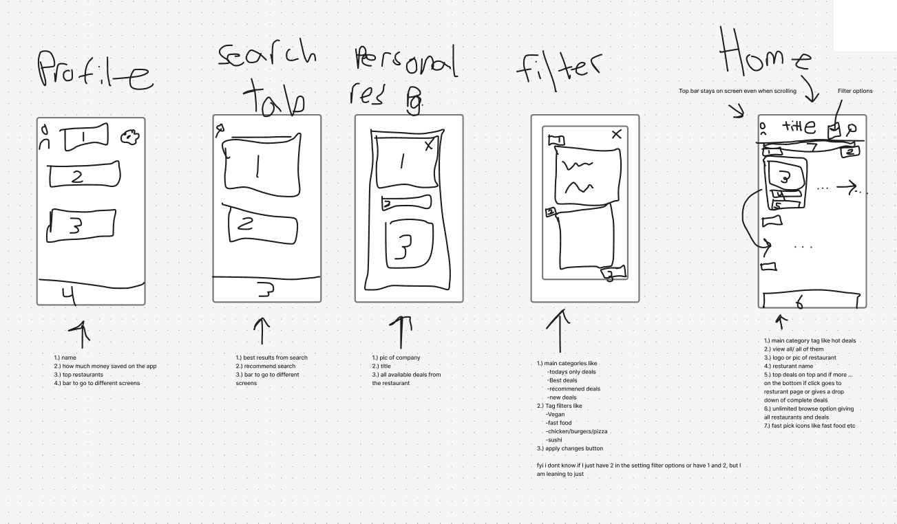
Initial Ideation and Sketching
Once the problem and goals were defined, the project moved into early ideation. Hand sketches were used to test layout options, navigation placement, and the order in which information should appear.
The first concepts emphasized immediate visibility of the most relevant deal. Navigation, search, and filtering were positioned for fast access so the experience would feel efficient from the first screen.
The early sketches and the first wireframe helped confirm the overall screen hierarchy, the placement of key actions, and the flow between browsing, filtering, and selecting a deal.
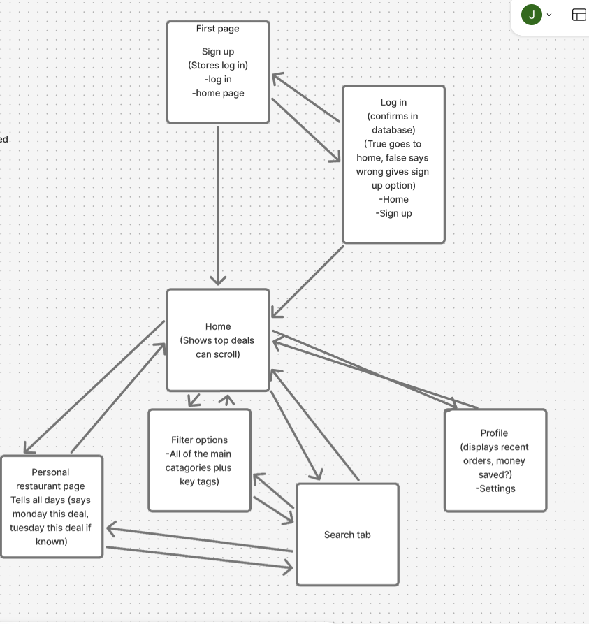
Wireframing and System Design
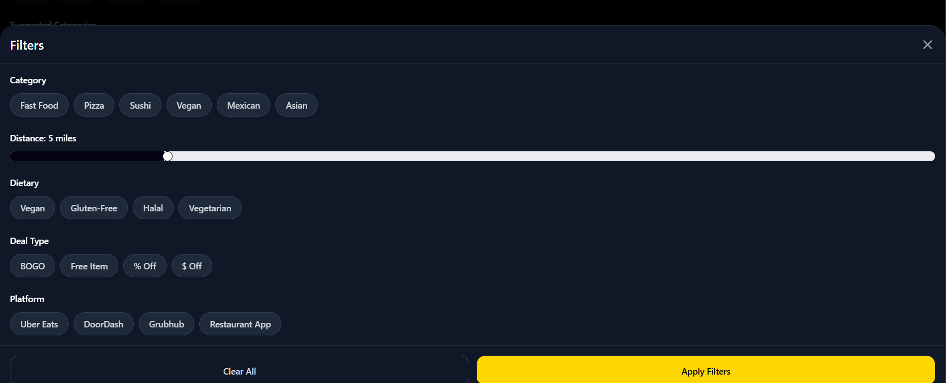
The next step was to turn sketches into more structured wireframes. This stage helped define where deal cards, filters, and navigation should live, and it made the user journey easier to evaluate.
A system flow was also mapped to show the path from opening the app to choosing a deal and being redirected to the source platform. The intended flow is simple:
- The user opens the application and location is detected.
- The system displays a ranked list of nearby deals.
- The user refines results with filters or search.
- The user selects a deal and is redirected to the appropriate platform.
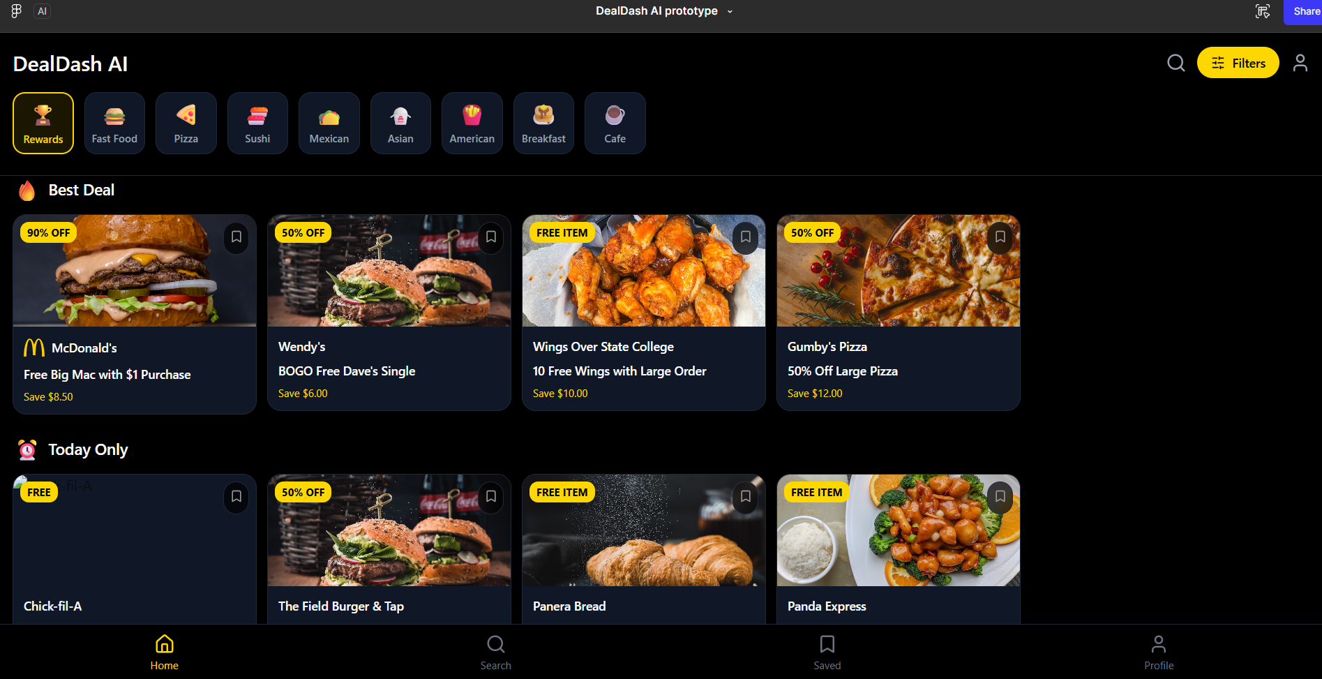
Prototype Development
After structure and flow were established, a high-fidelity prototype was developed in Figma. The prototype simulated scrolling, filtering, and movement between screens so the experience could be tested as a realistic product concept.
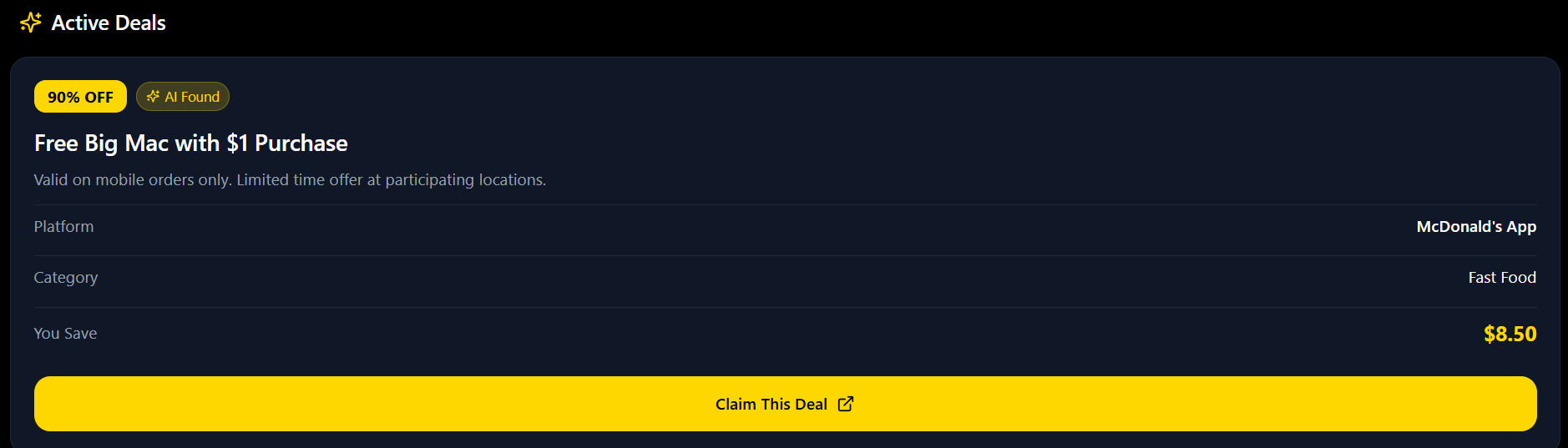
Spacing, icon use, and card hierarchy were refined so that deal values could be understood quickly. Deal cards were designed to make savings visible at a glance, while filters supported more focused exploration.
UX Design Principles Applied
Several UX principles were used to keep the concept practical and readable.
- Visibility of system status through clear pricing and savings labels.
- Recognition over recall through icons and visual categories.
- Efficiency of use by reducing the number of steps needed to decide.
- Consistency across screens so the experience feels predictable.
- User control and freedom through direct redirection to the source platform.
Iterative Feedback and Presentations
The concept was presented in stages so feedback could shape the next version. Early presentations focused on the problem and concept; later ones focused on the prototype and its usability.
Feedback pointed toward interface clarity and stronger comparison visibility. In response, spacing, card structure, and filter organization were refined to make the decision process easier to scan.
Core System Logic
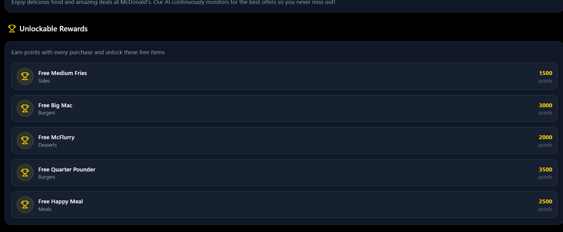
At the logic level, the app ranks deals by estimated monetary savings, while also considering platform reward systems, popularity, and time remaining as supporting factors.
This ranking approach keeps the highest-value options at the top and helps the user trust the order of results. The logic is meant to reduce the effort required to make a decision rather than simply show every possible offer equally.
Future Work
There are several clear directions for future development. These include personalized recommendations, expanded filtering, and more refinement of comparison features.
- Personalized recommendations based on user behavior.
- Filters for loyalty programs and subscription benefits.
- Stronger deal comparison tools.
- More user testing to validate design decisions.
Conclusion
DealDash AI shows how a user-centered process can address a common everyday problem with a clear and useful digital solution. The project moves chronologically from issue discovery to research, concept development, prototyping, and refinement.
For a portfolio, this matters because it shows process, judgment, and a design mindset that is grounded in real user needs rather than aesthetic alone.