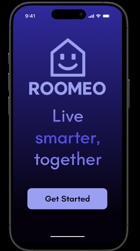
Roomeo
Roomeo is a roommate-focused mobile concept designed to make shared living feel more organized and less reactive. The project grew through research, architecture planning, prototype refinement, and usability testing. Each stage shaped the next.
Overview
Shared housing creates recurring coordination problems: who owes what, who does which chore, and how to handle disagreements without turning everything into a group chat issue. Roomeo was built around that everyday friction.
The goal was not to add another generic task app. The goal was to make one clear system for chores, rent, and communication that could support roommates who need structure but do not want extra complexity.
Project Materials
Each deliverable captures a different part of the process, and together they show how the concept moved from early planning to a finished presentation.
- Contextual Inquiry Plan - Defines the target users, setting, and observation goals for the early research phase.
- User Research Report - Summarizes participant behavior, recurring pain points, and the need for a unified roommate tool.
- Information Architecture - Organizes the app around chores, rent, and communication so the structure stays simple.
- Prototype Modification Mini Report - Documents the changes made after early testing revealed unclear labels and weak feedback.
- Usability Testing Report - Presents moderated and unmoderated results, including task success patterns and improvement opportunities.
Problem
Roommates often manage responsibilities through a mix of memory, spreadsheets, Venmo, texts, and informal agreements. That works for a while, but it becomes fragile as soon as money, timing, or expectations are unclear.
Roomeo addresses three connected problems: shared responsibilities are hard to track, financial obligations are easy to miss, and conflict is often avoided instead of resolved directly.
Research and Context
The research phase started with a contextual inquiry plan that focused on college students and young adults living with roommates. The observation goal was simple: understand how people actually assign chores, split costs, and handle tension in shared spaces.
The early research report confirmed a pattern that kept showing up across participants. Organization matters, but communication is just as important. When those two pieces are disconnected, small issues become repeated friction.
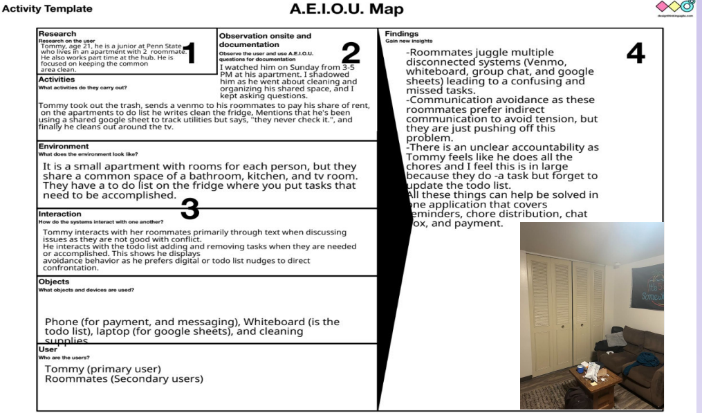
Observation Map
The AEIOU map showed that roommates were using multiple disconnected systems at once. Venmo handled payments, whiteboards handled chores, and group chats handled everything else.
The biggest theme that emerged was the gap between organization and communication. Users could stay technically organized, but the handoff between reminders, payments, and follow-through was still messy.

Environment
The observation context was an apartment environment where tasks were shared but not always formalized. That setting made it easier to see how people rely on memory, quick reminders, and informal systems when no single tool brings the workflow together.
The small stock photo keeps this part of the page visually balanced without letting the image dominate the section.
- People wanted a clearer way to track chores and rent.
- Participants were already using disconnected tools to stay organized.
- Users avoided conflict when the system did not make expectations obvious.
- There was strong interest in a single place for reminders, status, and updates.
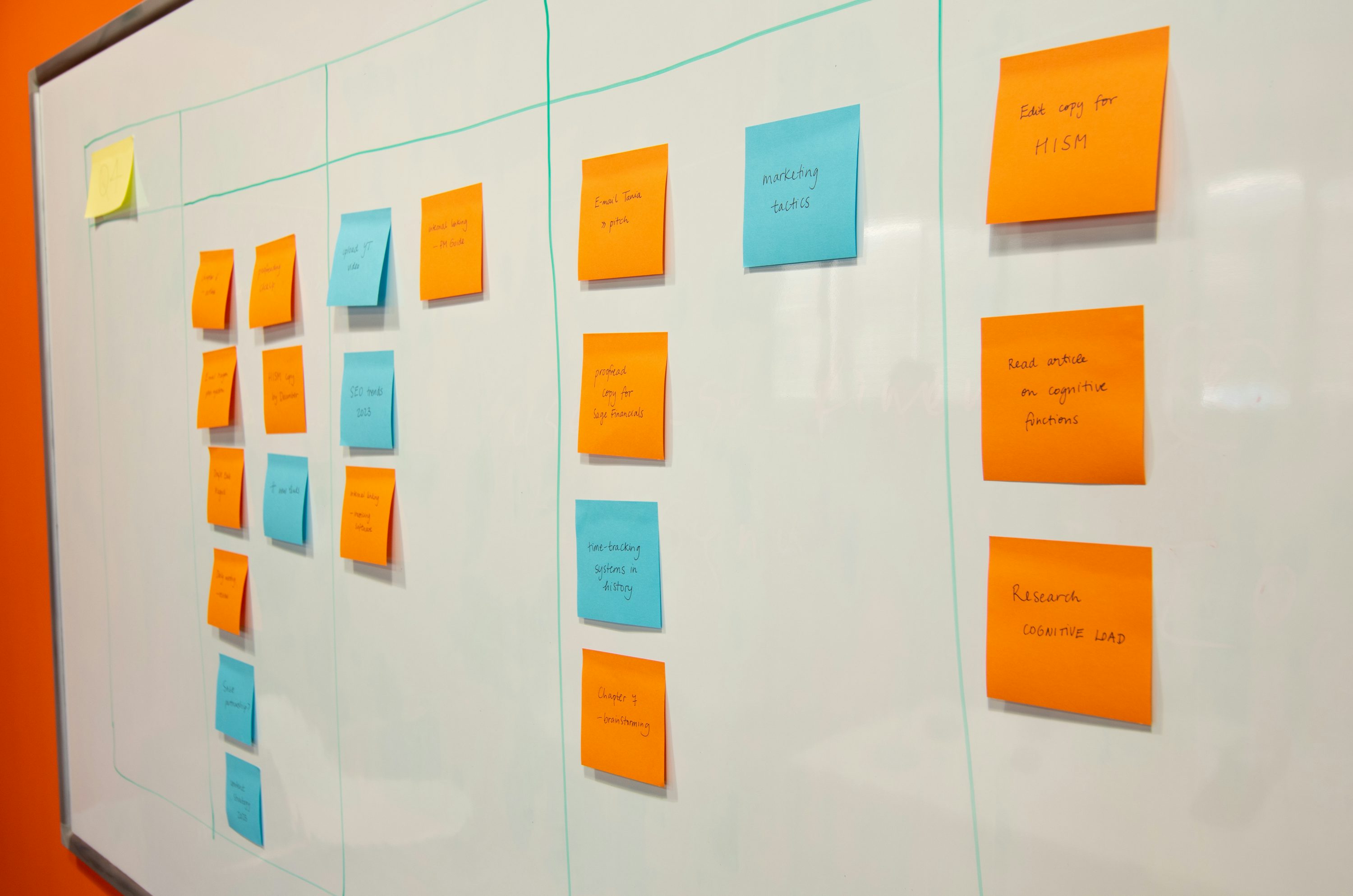
Information Architecture
Once the problem was clear, the interface structure became the next focus. The architecture organized Roomeo around three main actions: view shared expenses, manage chores, and communicate about issues in a more structured way.
The information architecture work helped define how users would move between those areas without feeling lost. The layout needed to be simple enough for quick use, but still specific enough to separate chores, payments, and conflict support into distinct tasks.
Prototype Modification
The prototype modification mini report focused on improving how the app responded to user expectations. A few parts of the first prototype were understandable, but some actions were too vague or did not provide enough feedback.
That stage pushed the design toward clearer labels, more obvious touch targets, and stronger confirmation states. The goal was to make interactions feel predictable instead of making users guess whether something had worked.
One key change was treating the chore flow as a primary action instead of hiding it behind vague wording. Another was making the app more explicit about where users should go next after completing a task.
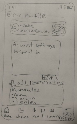
Sketch
The sketch shows how the first screen ideas were organized before the interface became more polished. It captures the early structure of the profile page, room list, and bottom navigation.
Using the sketch in the report connects the first rough idea to the more refined prototype screens that came later.
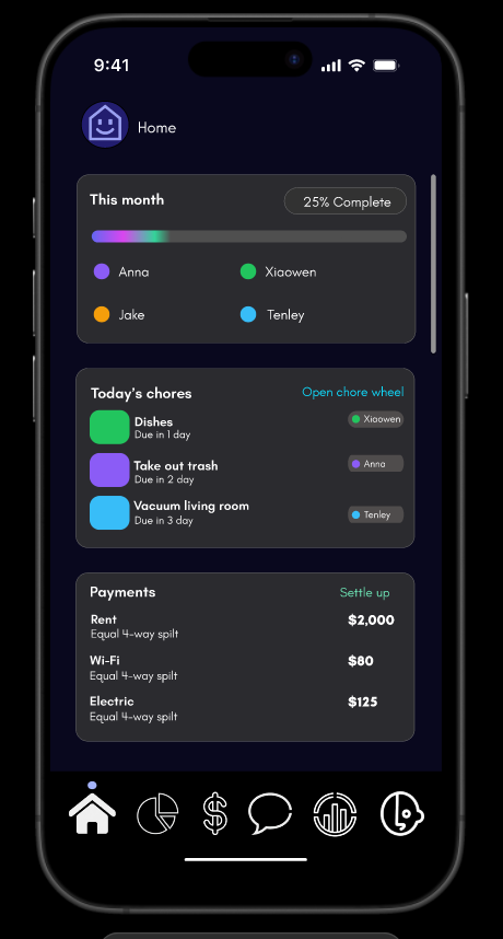
Home
The home screen combines the month summary, today's chores, and payment prompts into one place. That layout helps the user understand the current state of the apartment without digging through separate tabs.
For the project, this screen sets the baseline for the rest of the experience. If the home page is clear, the rest of the system feels easier to trust.
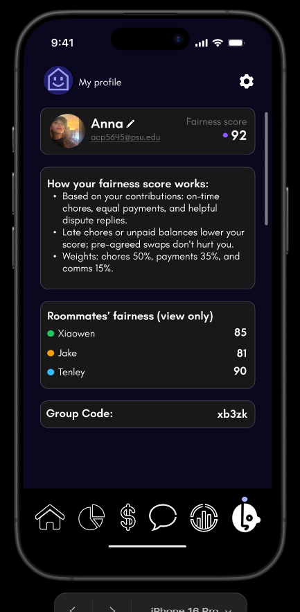
Profile
The profile view shows the fairness score and roommate summary in a simple, readable format. It gives the user a quick sense of how responsibilities are being shared without making the screen feel overloaded.
That kind of visibility supports one of the app's main goals: make the current social and practical state easy to read before frustration builds up.
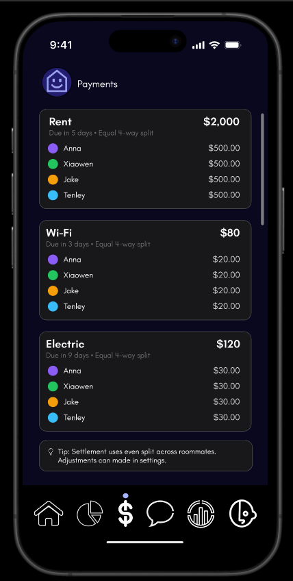
Payments
The payments screen breaks shared bills into clear parts so each roommate can see what they owe. This section matters because rent and utilities are one of the fastest ways roommates lose track of shared responsibilities.
The design keeps the amounts obvious and uses consistent grouping so the user does not need to recalculate the split every time they check the page.
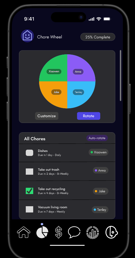
Chores
The chore wheel translates a recurring household problem into a visible system. Instead of relying on memory or repeated reminders, the app shows who is responsible and when tasks are due.
This screen is one of the most practical parts of Roomeo because it turns routine tasks into something that can be tracked, rotated, and reviewed.
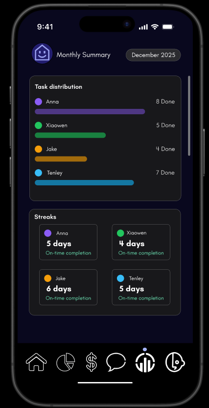
Stats
The stats screen gives a monthly view of task distribution and streaks. It is useful because it adds a longer-term perspective to what would otherwise feel like isolated daily chores.
That framing helps make fairness visible over time instead of only in the moment, which is important for roommate trust.
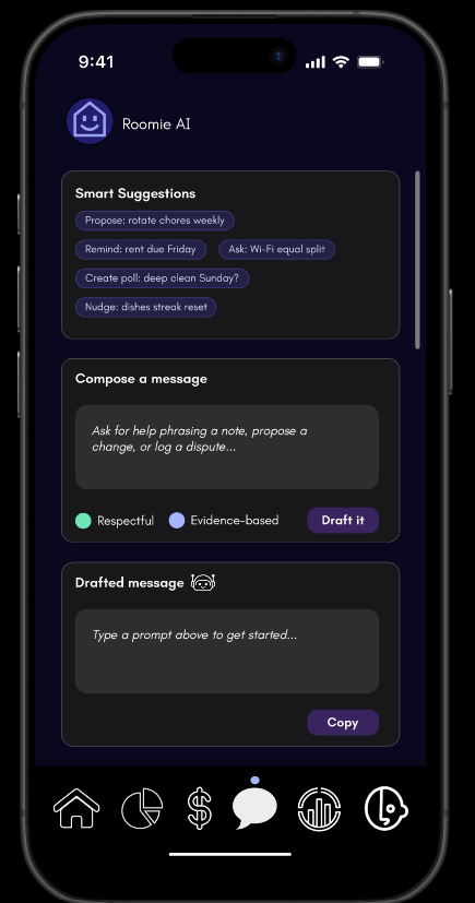
Roomie AI
The AI messaging screen helps users phrase a note, draft a reminder, or handle a dispute in a calmer way. It is not there to replace communication, but to support it when someone needs help starting the conversation.
That feature adds the clearest example of the app's broader goal: making difficult roommate interactions less awkward and more structured.
Usability Testing
Testing included both moderated and unmoderated sessions. The combined format made it easier to capture what users said, what they did, and where the prototype fell short without relying on a single testing method.
Across the testing materials, the strongest result was that users understood Roomeo's purpose and saw value in it. The weaker spots were more specific: unclear buttons, missing feedback, and a few labels that did not match user expectations.
Moderated Results
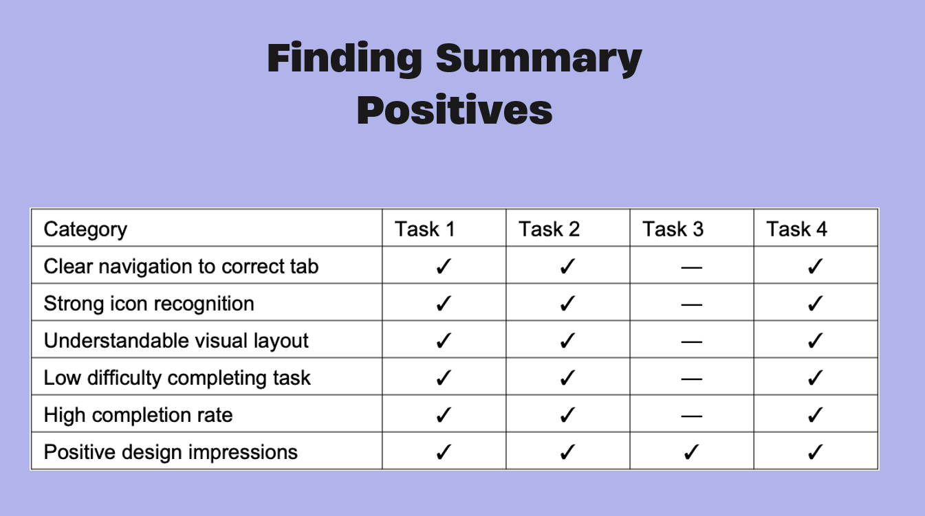
Moderated testing showed that users were generally confident when labels were clear and the layout made the next step obvious. Participants quickly understood the main navigation and were comfortable reading the chore and payment summaries.
The strongest positive pattern from the summary was clear navigation to the correct tab, strong icon recognition, understandable visual layout, low difficulty completing tasks, and a high completion rate.
Unmoderated Results
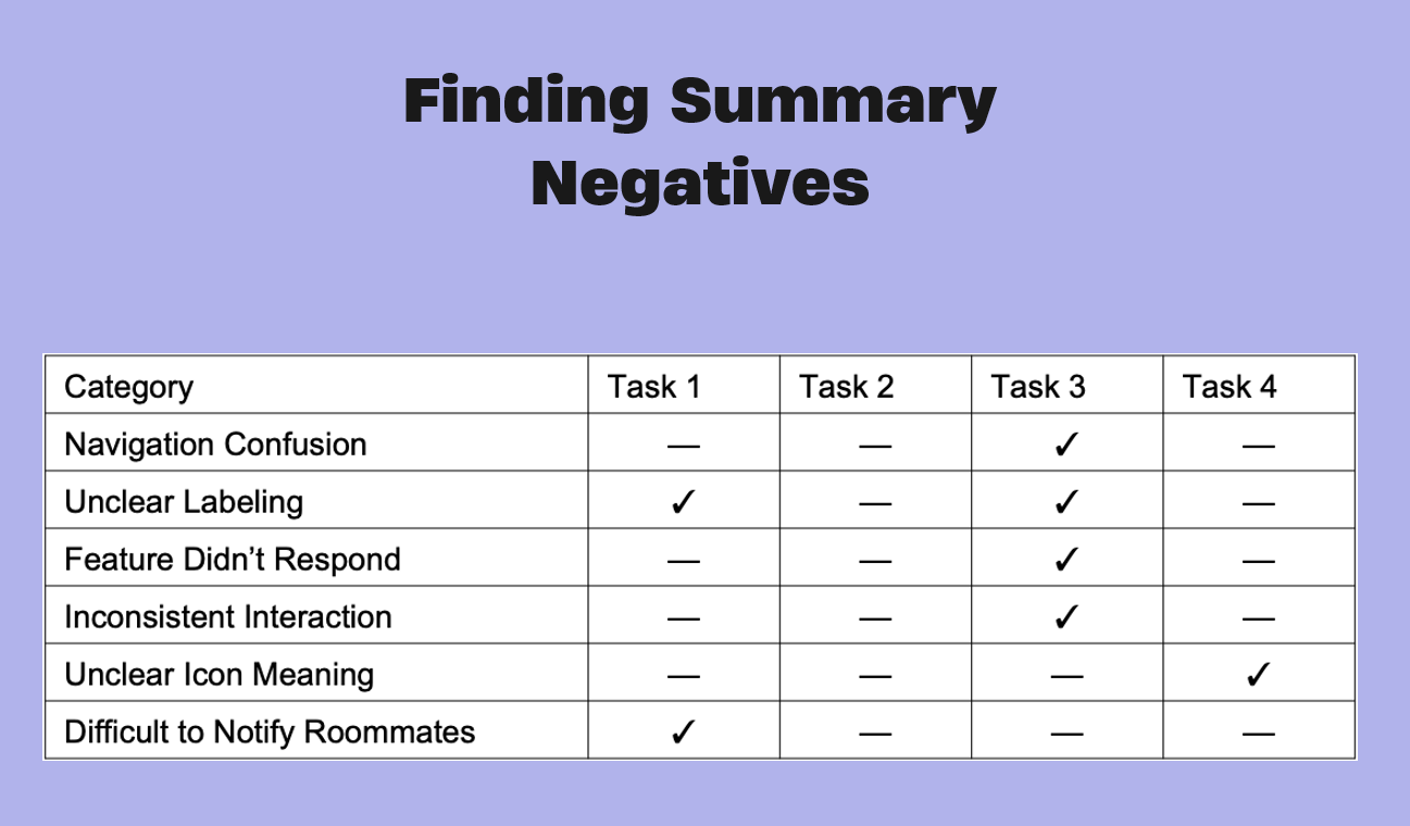
Unmoderated sessions reinforced the same issue: the app needed stronger interaction feedback. Some users hesitated when a control looked clickable but did not clearly respond.
The negative pattern from the summary was navigation confusion in a few tasks, unclear labeling, a feature that did not respond, inconsistent interaction, unclear icon meaning, and difficulty notifying roommates.
- Users quickly understood rent breakdowns and monthly summaries.
- Chore status was easy to read when the layout made it visible.
- Some users hesitated when an action looked interactive but did nothing.
- The app needed better confirmation and stronger affordance cues.
Findings and Iteration
The most useful findings were practical. Users liked the direction of the app, but they needed clearer navigation, better action feedback, and labels that matched what they expected to happen.
The mini report and testing deck both pointed to the same conclusion: Roomeo worked best when it reduced ambiguity. That meant making the chore flow easier to understand, clarifying icon meaning, and separating static information from interactive controls.
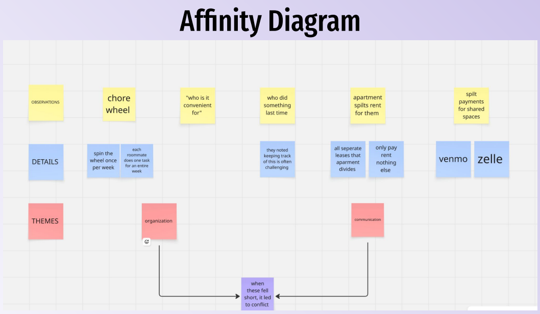
Research Synthesis
The affinity diagram pulled the research into a small set of repeatable themes: organization, communication, payment coordination, and the frustration that appears when one of those breaks down.
That synthesis helped shape the recommendations and made the later interface changes easier to justify in the final presentation.
Conclusion
By the end of the project, Roomeo had a clearer structure and a stronger case for why it mattered. The project showed that roommates benefit from a system that keeps responsibilities visible instead of scattered across apps and conversations.
Next steps would focus on onboarding, clearer action states, and stronger support for conflict-resolution messaging. The final presentation documents the completed direction and closes the project with a concise summary of what changed, what worked, and what should happen next.